The brief
The brief for this project was to develop a visual brand that speaks to the Merchants on the DoorDash platform. DoorDash helps many businesses of all sizes grow - from the small corner bakery, to the large grocery chain. Small businesses in particular face many overwhelming challenges: staff, rent, inventory, inflation, technology, third-party partnerships, and navigating the ever-changing convenience economy. One thing that makes DoorDash unique from other delivery companies is love and support for the people and communities it serves - indexing efficiency, cost-savings, and growth in a way that celebrates the diversity of needs in all of them. The brand aims to celebrate these offerings in an approachable way, optimistically speaking to the growth we offer to all of its business partners.
Visual Identity
The Merchant brand ID is built from the overall hero design DNA of DoorDash, but with some key distillations through messaging, color, shapes, tonality, and photography. The DoorDash brand is grounded in the ideas of human, helpful, and vibrant. It was from these that we defined several grounding words specific to merchant that we built from: Empathetic, Open, Reliable, Streamlined, Purposeful, Authentic, Expansive.
Brand system
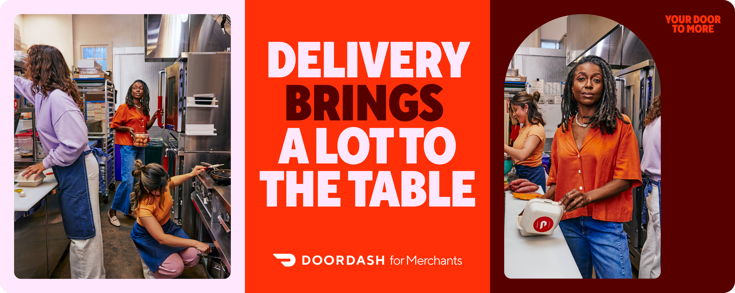
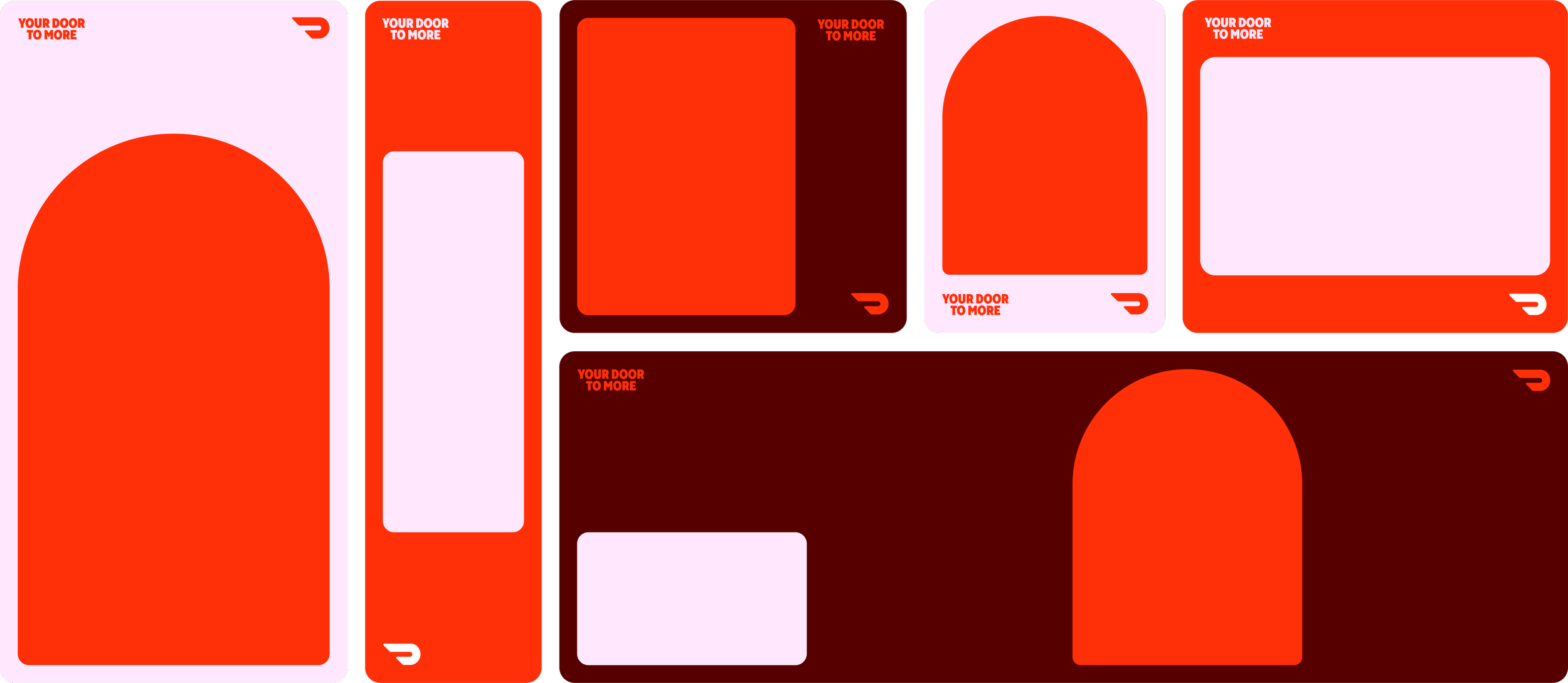
The Merchant brand uses rounded shapes as framing device to house imagery and also create a feeling of groundedness. Almost as if looking through a door or window, these shapes always form a frame to the stories of our merchants, capturing authentic moments in the Merchant experience. Bold typography with highlights of the DoorDash brand color serve up hard hitting messaging that speaks to the Dasher in a concise, focused tone. Our color palette offers a nice range of warm tones, creating a sense of hope.
Photography
We collaborated with photographer Laura Murray to capture the authenticity, optimism, and vibrancy of our brand. Our photography captures the merchant in a way that feels authentic and positive — shifting the focus away from the intensity of running a business to celebrating the love and passion from staff and business owners in being part of this industry. Natural light evokes expansiveness. Crisp detail captures streamlined feeling. Authentic expression captures optimistic tone. Colorful/Vibrant accents illuminate personality. We can use these stylistic pillars to ground us to the master brand while portraying the Merchants in a upbeat but still authentic way.
Applications
The brand was built to flex across every touchpoint and canvas size throughout the media funnel - from CRM, social, digital, web, events, print, OOH.


